Jump to
Part one: Why your website doesn't generate enough leads
Part two: The basic ingredients every MSP's website needs
Part three: Service pages, your USP, and benefits vs features
Part four: Data capture, social proof + a frictionless experience
A few weeks ago I ran a 5 part mini course on email about how to improve your MSP's website. So it generates more leads and ultimately gets more prospects on the phone.
A number of people have asked for a copy of the emails. So here they are, wrapped up into one blog article.
Part one: Why your website doesn't generate enough leads
Your website is your shop front. It's the most important online marketing asset that you have.
A few months ago I did an individual website critique for every MSP in a marketing programme I ran. I did 45 critiques in all. And I noticed a real trend.
Which was that most people's websites were just "average". They really were. In fact, it's shocking how similar most MSPs websites are to each other, and how "average" they are.
There were one or two that were really good. None were perfect... although I don't think the perfect website can exist.
But here's the thing... your website is so important that you owe it to yourself, your family, your staff and even your clients and your future clients, to get your website as near to perfect as it can be.
Your website must have a look and feel that appeals directly to the target audience
What do I mean by target audience?
I mean, the people that you would love to be ideal clients.
So if you picture in your head right now, what does the ideal client look like from your point of view?
They will probably have a certain number of users. Geographically, where are they? From an attitude point of view, what kind of clients are they?
What kind of thinking do they have? We all want clients who are willing to invest in technology, willing to partner.
Maybe your ideal clients work within a certain sector or a vertical.
You've got to make sure that when someone lands on your website, that immediately, at an emotional level, they are engaged.
Once you do that, half the battle has been won.
Because actually the reality is most people when they get onto your website, they're doing what's known as a bounce. They land on your website, they have a quick poke around and then they hit the back button. We call this a bounce because they're just not engaging with the content.
(I have a couple of tools to suggest to you on Friday to watch this happening in your website. It's terrifying when you see it).
But you've got to make sure that whoever it is that you're looking for, your website immediately appeals to them.
Side note: If you do have one specific vertical or niche that you work in and you also have general clients (and lots of MSPs are like that), you may decide to have two websites. You may decide to keep your general website and set up a specific website, aimed directly at your vertical.
Back to what I was saying. When we look at stuff, we have things that we think about with our brains - things that we think about cognitively. And then we have things that we think about emotionally.
And the rational mind, the brain is kind of like Spock from Star Trek. It's all very logical. It uses past experiences to ascertain what's going to happen in the future.
The reason I'm telling you all of this is most MSPs when they put their website together, they're putting it together using their rational mind; using the logical cognitive part of their mind. Because they believe that other people are buying that way.
Actually the reality is unless you sell to internal IT support managers, the people you're selling to do not think rationally at all. They can't because they don't have the knowledge that you do.
Your normal B2B buyer cannot think rationally for one key reason. They do not know what you know. They haven't heard of ID Agent. They don't know what ConnectWise is. They don't understand IT Glue. They don't understand technology stacks.
They don't even know how important it is to encrypt their devices. They don't really see two-factor authentication as a useful thing, they see as a bit of a pain... "does that means I've got to generate that code?"
They can't use their mind because they don't have the knowledge that you have. Most MSPs forget this with their marketing. You assume they know what you know. But they really don't.
So they're not using their rational mind. Instead they're using their emotional mind.
The emotional mind is gut feel. There's no logical thinking going into it. They're not looking at your website versus someone else's website and saying, "Oh, I see this IT support company here is a Microsoft Gold partner; that makes them excellent."
They just don't know what this stuff means. And so you cannot influence them at a cognitive level. They are making buying decisions based on gut feel and emotions and whether or not they LIKE you.
Now, this is a massive, massive thing for your website, because what we've got to do is we've got to put a mix of these together.
And the mix is where the 80% of the way they're influenced is through their gut. But we've also got to give them a bit of information for their brain to be satisfied.
Put it in another way, they make the buying decision with their heart and then their brain rubber stamps the heart's decision.
So you've got to figure 80% of your marketing to their emotions and 20% of your marketing to their brain.
And what that means in practice is you've got to make sure that your website has 10 times the amount of emotional appeal than it currently has.
When I was doing those 45 website reviews, about 43 of them simply didn't have enough emotional appeal. They were too dry or too cold. They were too impersonal. They didn't feel human enough. It didn't feel like they were people.
Where are the people? They're never enough people on people's websites. I need to see people. And I don't mean stock images, we'll come onto this later on in the week. But you've got to give me the people and the emotional appeal comes from the people.
You've got to have it clear in your mind about who the buyers are. This is what I was talking about in terms of clearly defining who do you want.
If you only want businesses that start at 50 users, you want 50 to 200 users say, then you've got to have a website which talks to those people.
And you've got to think right. Someone who owns and manages a 50-user business, how do they think?
What do they feel? What are they worried about? What keeps them up at night?
Because it's a wholly different sets of things than someone who's got five staff.
When you've got 50 staff by the very nature of having that many people to pay every single month, you have to have systems. You have to have extracted yourself from it. You have to have a management team. You have to have HR, you have to have all these other things.
So the kind of decisions that are being made by a minimum 50-user business compared to a minimum of five user business are wholly different. And you have to be very, very clear who it is that you want.
You cannot appeal to everyone with one website. It is simply impossible. It physically cannot be done. So you've got to be very clear on who you want.
Now, the other thing that you've got to be clear on is you've got to make sure that your design and your content of your website matches those target buyers.
I'm not a designer. Yet I know good design when I see it.
Certainly your design and your content need to feel up-to-date. From a website point of view, you're not in competition with other MSPs, you're in competition with ALL other websites. They are judging you and your business based off your website, comparing it to all the other websites that they use.
And if your website looks or feels old, impersonal, or just not emotional enough, then that's the judgement that they make.
This is your online shop front.If you're walking down a street and you see a shop front, and it's old and hasn't been updated for a while. And the sign is a bit faded and the windows are dirty.
Then you wouldn't be surprised to put your head inside the shop and expect that the shop itself to be the same.
And it's exactly the same with your website. If your website looks a bit old and a bit crap, then they will judge the book by the cover. And they will assume that your service and your team and what you do is a bit old and a bit crap.
If someone lands on your website and it's crap, they just leave. They simply don't take time to look around.
Part two: The basic ingredients every MSP's website needs
These are the easiest, fastest fixes to your website. Because these are the changes that have the biggest emotional impact on your prospects.
First up is an intro video. It's an absolute must. And ideally it'll feature your team... or better still, your clients, talking about how they couldn't run their business without you.
The reason that an intro video is so powerful is because video is the most engaging content.
And if you can get the right kind of video, a really well produced Hollywood style video, that ticks so many boxes.
SIDE NOTE: You can see some excellent examples on my website https://www.mspvideos.co.uk/
The place to put that video is as high up the home page as you can.
So literally, the first thing that people see when they come into your home page is that impactful video of other people, your clients, talking about how great you are.
It's perfect. It literally ticks so many boxes. It's beautiful.
You then need a well-written home page. Which normally means something written by a professional.
If you've written it yourself, it's probably OK. But OK isn't good enough. Have a look on Fiverr.com and on copify.com, both of which operate in the UK and USA.
Copify is like hiring a writer on Fiverr except there's someone doing the hard work of selecting the writers for you. And I would always say it's worth paying £100 or $120 for someone else to write your home page for you.
The best process to do this, is for them to interview you over the phone or a Zoom. Record it, get it transcribed, and then essentially your own words can become the home page.
All they've got to do is edit and shape your own words. And that's a very powerful thing to do. In makes life easier for the writer, too.
Just make sure your website is written from their point of view, not from your point of view. So you want to avoid things like, "We do this, this is all about us, we like this." It's not about you. You write it from the prospect's point of view.
This content needs a powerful headline. My favourite is "1,858 people in TOWNNAME trust us to keep their business running every day". The number is a real number of users you support.
Other things you need on your home page is an excellent professional photo of you and your team.
Also, some testimonials (social proof). LOTS of testimonials, preferably with photos. Or if not then company logos. Make sure you use full names and company names. Hiding details kills testimonials. "Mr G" is not as influential as "Paul Green, CEO, XYZ Corp".
And a clear Call to Action (CTA). Best practice for this at the moment is to embed your calendar into the website (use Calendly or Microsoft Bookings, part of 365).
Let them schedule a 15 minute video call with you right on the page... every time they have to click something you will lose people.
You can also add trust badges, such as your Microsoft partner logo. Just try to stick to the ones that ordinary people will have heard of. They'll be more influenced by the logos of your local media titles, than the ID Agent logo.
The other page that's really important to have is a brilliant about us page.
In fact, if you look at any kind of analytics, you'll see that on most websites, most people are looking at the home page and the about us page.
Sometimes they're going to look at some of the service pages and sometimes they go to the contact us page.
But typically, the two most trafficked pages are the home page and the about us page.
Those two pages are essentially versions of the same thing. So in an ideal world an about us page would have more videos on. In fact, it might have some case studies of the clients that were in the video on the home page.
So the video on the home page might be just a 60 second montage of clients talking. But then you might have 3x case study videos on your about us page. 60 to 90 second case studies of each of those individual clients.
You might have another video with you talking about your journey. You want to tell us why you started the business in the first place (maybe you ask yourself that every day!!!)
Show us a bit of a business nostalgia. If you've got a photo of you with more hair and your company van from 2005, that would be a great photo to go on there.
Because a) it shows you've been around for some time, and b) people love nostalgia.
The critical thing to remember about the about us page, is... it's not really about you. It's still about the prospect.
And yes, you can tell your story in a way which is about the prospects. In fact, you've got to tell your story because it humanizes you in some way. If you go into my about us page: https://www.
I actually tell quite a long story. I tell the story of my transition from struggling business owner, into someone who's got a grip on things. And it's also explains why I can work with MSPs. And it tells you about some stuff that happened in my life, which is all 100% by the way.
The reason I do this is it's a way for you and me to bond.
And I want us to bond, I want you to look at that and say, "Oh my goodness, this guy is just like me, except he's not a tech."
That makes me more real to you. And that's the kind of thing that you've got to achieve on your about us page.
Which is, using your story and showing your experience in a way which bonds you to the people that you want to buy from you.
Here's the thing, I know that your story is actually probably quite dull!
You were probably consulting and just got a bit sick of it, or you enjoyed the money but you didn't like the inflexibility of it, or whatsoever. And so you started off on your own part-time.
Eventually there came a point where you just sort of threw yourself into it. And fast forward 10 years, you've got six staff and you still got your very first client. It's a very similar story, isn't it for most MSPs?
Well, what you do is you take that story and you embellish it and you enhance it.
Because that is actually quite a dull story. So you talk about how you were working somewhere else. But you didn't think they were looking after the clients properly. And you didn't think that they were being proactive enough. Because actually you realized that so many problems can be fixed before the clients are even aware of it.
That's the kind of story that people love. And then you talk about how it's just been rapid growth since then, how your clients love you so much, that they've stayed with you.
Some of them for 15 years, that you now look after 1,823 people in this area, which is your user figure number ( that you've already used on the home page... make sure thr two figures always match).
The other thing then that we want to use is lots of photos of real people. And your staff are going to hate me for this, but I don't care if they don't want to have their photo taken.
Because I want to get you more new clients and help you sell more stuff so you can pay them more, which is always the reason for why you need to have photos.
You need more proper professional photos of you and your team. And you really need them to be updated every couple of years or so, just so you can put lots of photos on the website.
A key thing to remember with this, is people buy from people. So, you've got to show them the people. And if you're not showing them the people, they don't know who they're buying from.
It's got to be real photos, of real people, and captioned as well. So it's really obvious that these are the people they're buying from.
If you're a one man band or a woman band with just a bit of help and that's not an option, then you make the photos all about you. And you become the front person of the business.
Richard Branson does this very, very well. He doesn't run the Virgin companies but he is the front man of the Virgin brand, and gets involved in fronting that up. You can do exactly the same thing. You can pull that trick off if you've got 100 staff, or if you've got one member of staff. You can be the front person for the business.
If you have got some staff, even if it's just two or three, rope in a few of the people, get your other half in there for the day, get the part time admin person and do a photo shoot.
Put yourselves all in company t-shirts or something like that, so it's pretty obvious you all work there.
Your staff will try and get out of it if they don't want to. In fact, it's probably the number one whinge from staff is, "I don't want to take part in the photo shoot." Or they're talking about privacy concerns or whatsoever.
I think the answer is always: "Look, people buy from people. We need to show them the people. And ultimately, I want to pay you more, but we need to get more new clients to pay you more. The photo shoot is happening on Thursday. It'll take 30 minutes."
I have heard of MSPs giving copies of the photos to their staff as well, for them to go and use on LinkedIn or whatsoever.
I also know that some people are scared of putting photos of their staff on the website because they don't want their competitors to come and steal them. The way I would look at that is, your competitors are going to find out who's working for you anyway, they're only going to steal the staff that aren't engaged.
I don't believe putting your staff on the website is going to speed that up or cause it to happen. I could be wrong, but that's my gut feel on that.
Part three: Service pages, your USP, and benefits vs features
Most people aren't looking at your services pages. Don't believe me? Check your analytics.
But you still need these pages, if only for SEO (Search Engine Optimisation) purposes.
I would set up an individual page for each of your core services. A small number of people will go looking for them. More importantly, Google will see them.
The size of your website is one of the factors that affect where you rank.
Here's the thing, don't obsess over the services pages. Don't spend too much time on them. Get your writer to write them, focused on the prospect and not you, of course.
Put a human face on each page. Get them done. Move on. Next!
By the way, the need for a big site for Google is also one of the reasons why you need to have a blog on your website. Google likes to see websites growing and adding fresh new content.
With a blog, you can then add new content every week or every couple of weeks. It's all organised automatically in your blog (or call it news if you prefer).
The more often you add new content, the more regularly Google will visit your site to reindex it. And the more often it visits, the better.
Let's move to talk about USP - or Unique Selling Proposition.
It's a really tough question to answer - why would I pick your IT support business, above all of your competitors?
Most MSPs can't answer this. Even I struggle to answer this with some of my clients.
But you need to find something that makes you the no brainer choice (called no brainer because ordinary people are making emotional decisions, remember). Something that helps you stand out, head and shoulders above your competitors. You then sprinkle this across your website.
The default USP is YOU. To prospects who don't understand technology, you're the only truly unique thing about your business. You and your team. This is why I'm such a big fan of putting your photos all across your website.
Opening hours is another potential USP. For some people it's one of the big factors when they're picking an IT support company. Can they pick up the phone at 8am?. Can they do the same at 8pm?
This is one of those areas where you look at your opening hours as a competitive advantage or disadvantage. If you're standard 9am to 5pm, then some people will consider that to be a disadvantage.
Whereas if you are operating 8am to 8pm, some people will see that as an advantage. If you can operate some form of 24 hour support using an outsourced service desk at night, that could become your USP.
I was talking to a new MSP Marketing Edge client recently. He'd just started using https://www.helpdeskbuttons.
This is a newish company in the States, which has come out of an MSP. They make physical help desk buttons. And the idea is, as the user, when you have a problem, you physically press the button.
It actually has massive advantages for you. It logs a ticket automatically. Plus captures information about the computer - the last 10 actions or something like that. It puts that info in the ticket and then submits that ticket through to you. Just by them pressing the button.
So you can see there's massive advantages for you and for them. They haven't got a faff about, find who to call. They haven't got a log a ticket, or find the number to call.
They press the button, and five minutes later the phone rings. It's tech support saying, "Hi, got your problem. We're just looking into it. We'll be back with you in 10 minutes."
It's beautiful.
And he's one of the only MSPs in his area to have Help Desk Buttons. And it was hidden away at the bottom of his website, where no-one would see it (the further down the page something is, the less likely people are to see it).
I said, "This is going to be widespread eventually. I really do think that. But for now you're one of the only people to have this. So make this the big thing. It should be across all of your marketing until all of your competitors are using it as well". That's a USP.
One final thought on USPs is that the more you specialise in a specific niche or vertical, the easier it is to create a USP. I only work with MSPs and mostly on marketing and growth. That makes my USP simple. I'm in competition with a tiny number of people.
Many MSPs are now adding a niche on top of their general business. Because marketing to a niche is 1,000x easier than marketing to a general audience in your local area.
My pro tip on this would be to have two websites - one for your general business, and one for your target niche. Then you can really go to town on both sites without diluting your message for the two completely separate audiences.
My final subject for today - benefits vs features.
When people talk about something, there are features of that thing and there are benefits. Let me give you an example outside of our world.
Your car will have seatbelts, and a whole series of safety systems connected to those.
You've probably got sensors under your bumper that can detect a collision within 0.001 microseconds of an incident happening. And when it does that, it will automatically pre-tense the seatbelt.
It will also explode the airbag. Drop the pedals down, and move the steering wheel away from your chest.
And all of this will happen before you can even possibly comprehend that an accident is happening, because these are all safety systems designed to help you and stop you being hurt.
These are all features. No one buys a car because it has pre-tension seatbelts.
They buy the car because it is safer than the other cars. Or you can drive it into a tree and you'll walk away with just a pain in your neck.
We don't buy things based on features; we buy things based on benefits. So long as we're ordinary buyers.
People who build and design cars for a living, buy cars based on features because they're insiders. Just like internal IT managers buy IT differently to normal people. They're an insider. They know the kind of things to ask about.
But the average manager or owner doesn't have the information, so they're just looking for the benefits.
I'll tell you what your benefits are now and this can go straight into your website...
"Our clients benefit from fewer disruptions, because we spot and fix problems before they interrupt them".
(yes I know most MSPs do this... but very few of them use it in their marketing)
In fact, you might even say that, our clients like the fact they don't have to contact us.
Part four: Data capture, social proof + a frictionless experience
You need to have some kind of benefit-driven data capture on your website.
I'm a big fan of data capture. Because it's such a solid way of building your email list. And there are a number of different ways of doing data capture on your website.
I should just say that data capture is less important an outcome than booking a 15 minute phone call with you. So your number one call to action on any of your pages should be to book a 15 minute phone call with you. That's literally the most important thing. And you would typically embed your live calendar into the site to do that, using Calendly or Microsoft Bookings, which is part of 365.
In terms of benefit-driven data capture, you want to get people to give you their email address in return for getting something. And that's what we mean by benefit-driven. Because no one will put their contact details in if it's just a case of, submit your email address, join our newsletter, that's it. No one wants to do that.
They might do it with eCommerce sites or fan clubs or stuff like that. But they will not do it with you.
So, instead you offer them something in return. We call this a lead magnet, or an ethical bribe.
The most powerful thing to offer is a free book, ideally a printed one, not just a PDF (as the perceived value of a printed book is 10x higher than a PDF... even if they contain the same information).
This is why I give a book called Email Hijack to all the members of my MSP Marketing Edge service. They can put their name on the front, and instantly become a published author. Plus they can then offer copies of that book on their website. An instant powerful lead magnet.
To drive this you need a CRM (not your PSA, a purpose-built CRM such as Mailchimp, MailerLite or ActiveCampaign). You can generate a form for your website. Make sure you show them a picture of what they're going to get, and tell them why you're giving it away for free (because you're trying to educate local business owners about the need for greater email security... and also, start a relationship with people. It's always better to be honest).
One final thought on data capture. I want to make it really clear to you, that it's really hard to get people to go through data capture. We have an opt-in list of, I think just under 2,000, and that's all been built the hard way by getting people to choose to opt-in.
A good quality list takes time and effort. But it's really worth it, because you can build a great relationship with people on email, and use the personalisation, tracking and segmenting tools in very powerful ways.
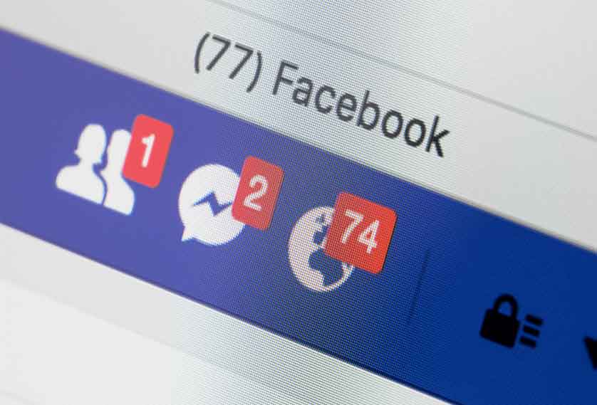
The other thing that you need all across your website is social proof. We touched on this in day two's email, when we talked about testimonials.
Social proof is where most people prefer to do what most other people are doing.
We are sheep. We cannot stop ourselves from following other people because our brains are still programmed like we're cave dwellers from 100,000 years ago.
And for cave dwellers, there was safety in numbers. I mean literal safety. These were the days when we were in the middle of the food chain.
It's why we tend to fall in line with other people's behaviour. We cannot help it. It's a deep rooted psychological driver. It makes us feel uncomfortable if we don't.
And it's why you need to get more case studies, more testimonials and more reviews. Put them across your website. Every single page should have a testimonial; ideally, a different testimonial. You should have case studies on your home page and your about us page. Because remember there are different versions of the same page.
You should try to get reviews on Google and Facebook and any of the platforms that you use, like Trustpilot. And then you can take screenshots of those to put into your website. This is perfectly acceptable, as long as you acknowledge where they've come from.
The home page video that we were talking about a few days, which is your clients talking about you, that's the best kind of social proof. It really is.
But you want some written testimonials as well, scattered around. And great testimonials have at the very least the full name and the business name of the customer. If you could get a head and shoulders photo of them as well, that would just be beautiful.
If not, then just the logo would do. But remember, people buy from people. Pics of people beat logos... unless the logo is a big company you support with a logo most ordinary people would recognise.
Final thing to look at today. And that's with how easy your website is to use.
You've got to make it very, very, very easy for people. In fact, we call this a "frictionless experience". The more friction there is using your site, the quicker people will leave it.
My brother's wife is a usability expert. She's got a master's degree in it. And she gets paid, not inconsiderable sums of money, by big retail companies in the UK to improve the usability of their Android apps.
There's one particular clothing company she worked with. Some of the changes she made added about 3% or 4% conversion to their sales. Looking at how much they sell, which is a considerable amount, that made a big difference. And all that she really does is remove friction.
This is why we all buy from Amazon. We don't all buy from Amazon because we think that Jeff Bezos is a good looking guy who really needs to be richer.
No, we buy from Amazon because it's frictionless. You're not selling stuff in the same way that Amazon is, but your website needs to be frictionless as well. Get friends you trust to use your website and tell you which bits of it are most annoying for them.
Oooh - while I remember - your website also needs to be up-to-date. Primarily there are two areas to look at.
One is down in the footer. Go look at your website now. Does it say copyright 2020 or copyright 2017?
It's a small bugbear of mine, that one, that the copyright doesn't roll over.
You can actually automate this. There's a plugin that will automatically update your copyright year in the footer on the 1st of January every year: https://wordpress.org/plugins/
The other thing that shows your website is up-to-date is the blog. When did you last post an article or video? In an ideal world it's once a week, or a couple of times a month. Nothing dates a website more than the last piece of content being added 5 months previously.
Part five: Three pro tips
There's an amazing app you can add to your website which allows you to see exactly how people are actually using it
It's called Hotjar.com. Go and get it now. It's free at a certain level - we use it a lot, and the free account is fine for us.
There are two benefits to Hotjar. The first, it shows you heat maps of what people are doing within your website. It'll show you red bits where people are clicking more. And I think blue, where they're just not looking.
The beauty of that heat map is it shows you just how little people scroll down web pages. It's why you've got to put the most important content higher up. Such as social proof - that's some of the most important content there is on a web page. It should be as high up as you can make it.
The other benefit is you get videos of people using your site. You can't see the person of course, but you can see what they did in the website. Hotjar is quite good at not showing you what it perceives to be sensitive information, if they fill in forms for example.
But it's fascinating, just fascinating watching what people do in your website. You can lose a whole evening watching these videos.
Some of my clients actually identify who the prospects are. They match up a video in Hotjar, then use a service such as Albacross.com, which is one of those services that tells you who's on your website.
So if they've had someone on there, they're looking at the video and can then look in Albacross to see who was on the website at that exact moment. That only works if you have a small level of traffic, of course. Perfect for most MSPs.
Side note, there are services such as HubSpot, which will do all of that for you in one package.... although it's quite expensive.
Anyway. Pro tip number two is to constantly be running an experiment. There's something called Google Optimize which is beautiful and it's free.
You've already got Google embedded into your website through analytics. It's easy to add Optimize. Just Google it.
It's a way of setting up split tests on your website.
So let's say you've got a web page. Let's call this page A. Google Optimize will create for you a copy of that page. It does the work. You don't have to build another page. It does it all for you. So then you've got page A and you've got page B.
Page A might have the headline of "1,058 people in TOWN trust us with their IT every day."
And then page B might be identical to page A, apart from the headline. You might change that headline to "trusted IT support in TOWN."
Let's say you run it for a split test for 300 people. So person number one will come and see page A. Person number two will see page B. Person number three we'll see page A, person four will see page B.,.. you get the idea.
They don't know that there's a split test happening. They don't know that there are two different versions of the page. This is happening to you all the time by the way. On Google, on Amazon, eBay, Facebook, they take it one step further. They do multivariate testing where they change the headline and the picture and lots of different things... but they have the huge amounts of traffic needed to do that.
You probably have so little traffic getting to your website, as most MSPs do, that it will take you some time to get 300 unique users through your website.
But what you can do is test the effect of changing lots of different elements in the page.
If you don't believe me, that pictures of people get more engagement and conversions than pictures of network cables or stock images, then do a split test! Do an identical page but you change the photo. One has a photo of you the other version has a photo of a stock image. See which one gets more outcomes.
We actually did a split test on our data capture pages about two years ago. We put a video of me on the data capture page and that got LOWER conversions! I was really offended by that. Because I predicted that the video of me saying "hey, you can get your free book" would actually improve conversions but it didn't. It made the conversions worse.
I'm glad we did the split test.
You should be constantly having an experiment on. It might be down to something like where your live calendar is embedded.
Try it. Do a split test where in one version you have it at the top and the bottom, and in the other version you just have it say at the bottom or just at the top.
Really, you can test any change. You've just got to make sure that you run it through enough web visitors. That's the biggest split test challenge for most MSPs.
Then, finally, pro tip number three is to refresh the look of your website every two years.
TWO YEARS??? Am I mad?
Not at all. I believe that websites age in dog years - every time a year passes on the calendar, your website has aged by 7 years.
And remember something I said in an earlier email. Your website is not just being compared to just other MSPs. You're being compared to ALL websites.
And as your single most important digital marketing asset, you really need to make sure you keep the shop front well decorated.